Designing a Great Contact Us Page: 20 Inspiring Examples


Your contact page isn’t the flashiest part of your website, but when your customers need help, it becomes their lifeline.
Whether you sell software, shoes, or aircrafts, customers will eventually need to reach you. It may be a technical issue, a question about an order, or uncertainty about the package that’s right for them.
Whatever the case, this often overlooked page takes center stage.
Here’s how having a great contact page can benefit your business:
It improves customer experience by making it easy to contact your company.
It solves problems before they escalate, especially when it includes support options, links to help center articles, and response times.
It opens doors to beneficial collaborations, from press requests to partnerships to new customer relationships.
It shows you’re legit. Nothing says “do not engage” to customers more than a company that hides how to contact them.
Done right, a great contact page can help boost conversion, improve your users’ experiences, and even win you new customers.
We’ve rounded up some great contact us page examples from across the web below. We’ll dive into why each example works and the smart strategies behind them so that you can build or level up your own version.


20 exceptional contact us page examples
We’ve put together a list of 20 exceptional contact page examples so that you can pick and choose the ideas that work best for your business.
1. Harvest

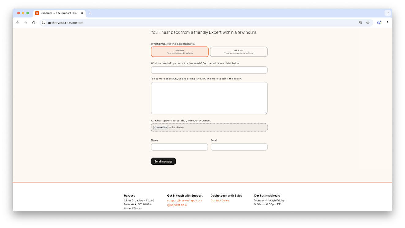
Harvest’s contact form is clean and thoughtful. Users can click a button to choose which product they need help with, then send a message via a polished, no-fuss form.
Harvest also includes their address, support email, social links, sales contact info, and clear business hours, all in a clean and appealing layout.
For extra bonus points, they also set expectations by stating they’ll respond within a few hours.
Clean layout, multiple contact options, and clearly communicated expectations? Harvest shows how a contact page can be both simple and incredibly effective.
2. Adyen

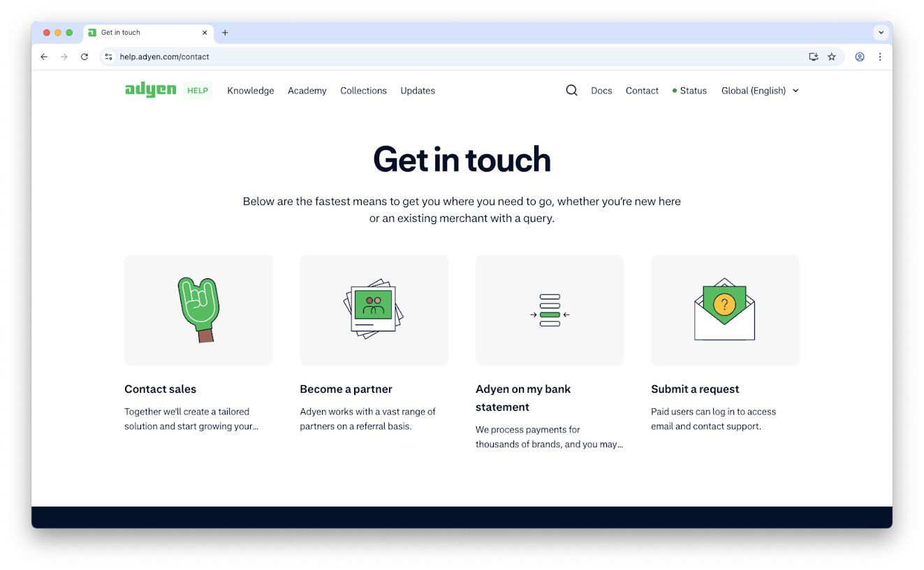
If you have different types of customers and you need to segment your contact information based on their needs, you can do what Adyen does.
Nailing clarity and usability, their contact page uses visual tiles, each tailored to different needs — from support to sales to partners — making it easy for visitors to find the right path.
It’s a smart combo of functionality and friendliness, perfect for both new users and long-time customers.
3. Vivobarefoot

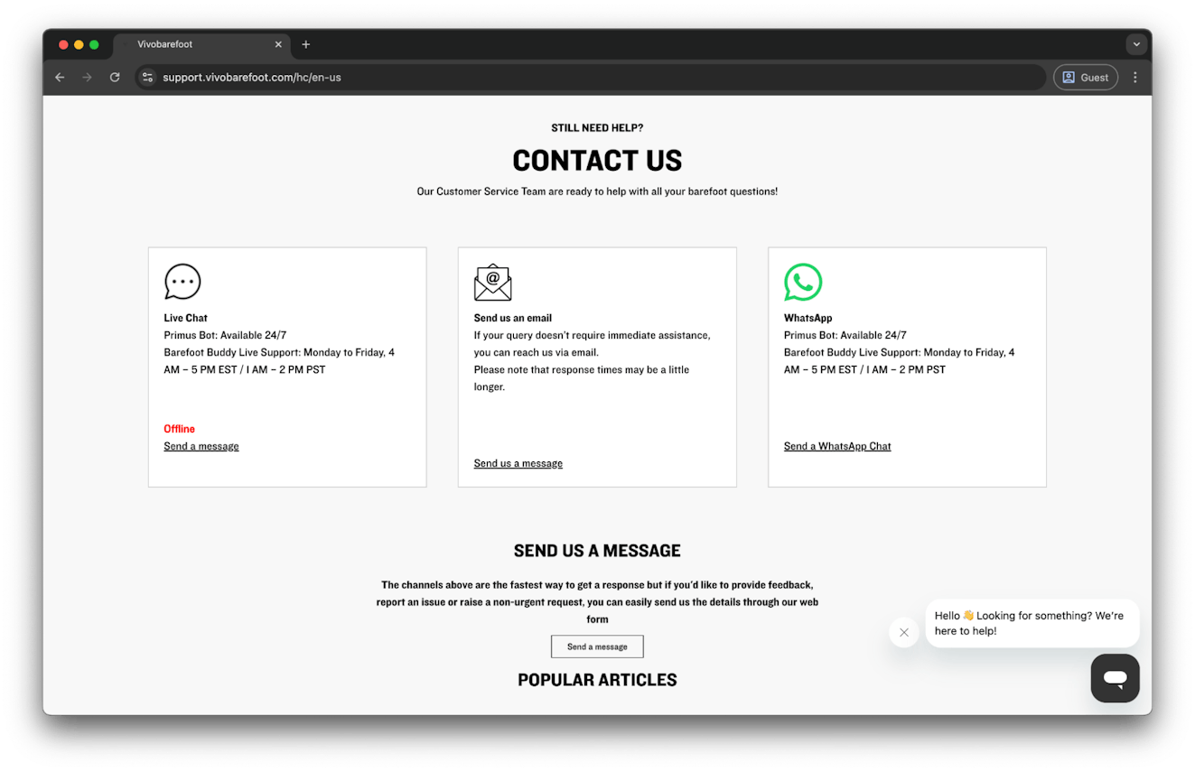
Whether they want live chat, email, WhatsApp, or a contact form, Vivobarefoot’s a prime example of giving customers their pick of support channels.
What’s especially smart is how the page is structured: Instead of leading with contact methods, users first see help center topics and common needs, like a sizing guide and return info.
If they can’t find what they need, they simply scroll down to the contact section.
This strategy is fantastic, because it ensures users are presented with the opportunity to find help through self-service options first, which reduces inbound customer conversations for the support team. But it’s done in a way that doesn’t feel inconsiderate or unhelpful — Vivobarefoot provides easy paths for all customer preferences.
4. Nike
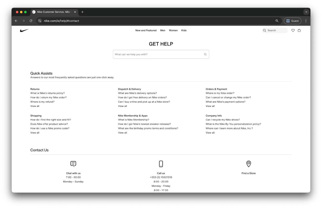
Not every question needs a human reply. That’s why Nike’s contact section appears after a list of common FAQs, a simple move that helps reduce support load. When users need direct contact, they provide key information — business hours, phone number, and store locator — at a first glance
For a brand that sells through physical storefronts and ecommerce channels, it’s a prime example of covering all the bases in a straightforward way.
5. Spotify
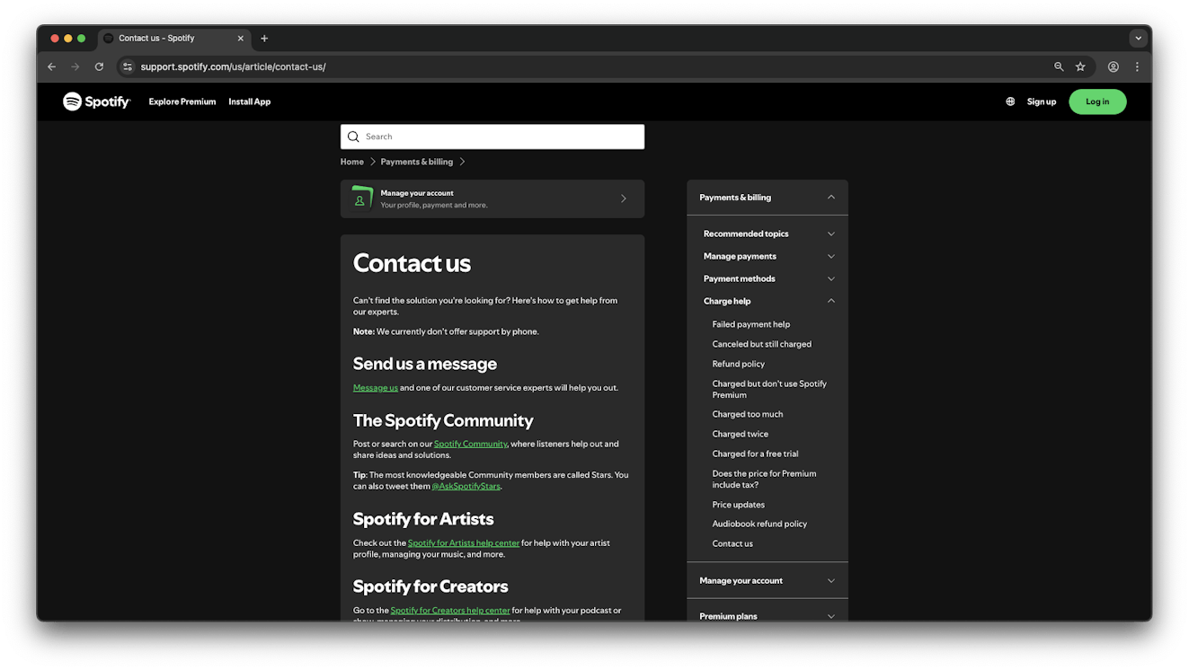
Spotify’s contact page puts self-help front and center, guiding users to the community forum where moderators and super-users often jump in with quick, helpful answers.
But if that doesn’t cut it, direct support is clearly visible and only a click away. It’s a great example of how self-service and human support can seamlessly coexist in one page, giving users flexibility without sacrificing clarity.
6. Revolut

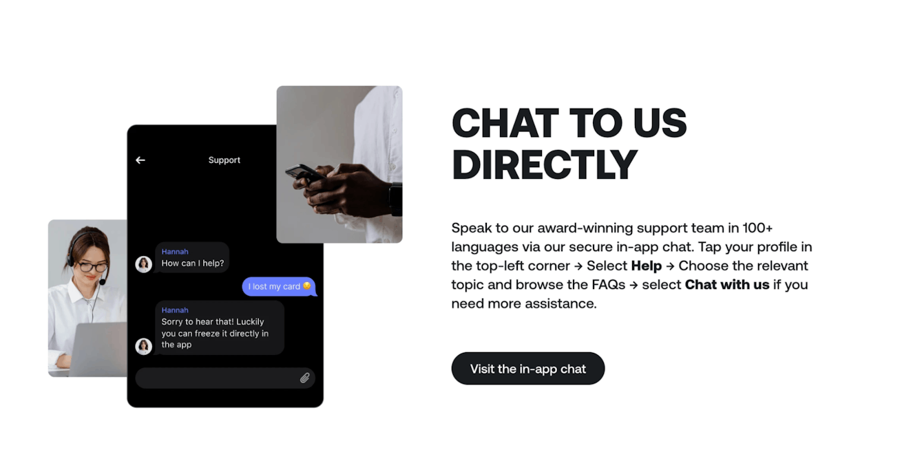
Like their app, Revolut’s page is about keeping things simple. Their contact page reflects exactly what they are: an app-first bank.
The primary channel?
Needless to say, it’s in-app support, where their users are. However, knowing that things happen and finances are a particularly sensitive topic, they offer a dedicated phone line for emergencies, but everything points back to the app experience. It’s an example of a contact page tailored to an app-first customer base.
7. ClassPass
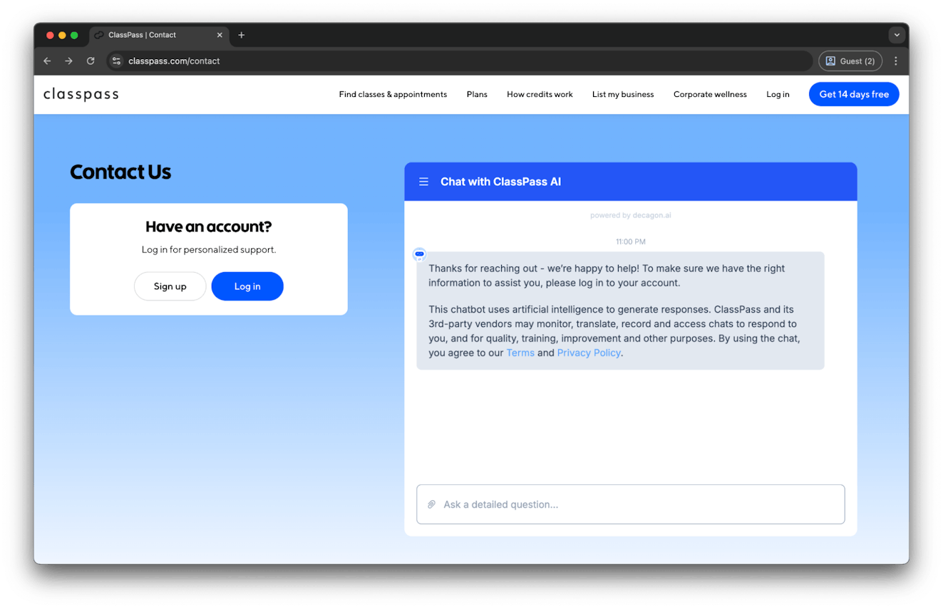
ClassPass follows a unique approach compared to the previous example, opting to replicate the feel of their in-app experience right in the browser.
Users are encouraged to log in for personalized support, and a chatbot is ready to assist 24/7 — no need to download or open the app. It’s a smart way to meet users where they are while keeping the experience consistent and intuitive.
While there’s still a link to their help center in the footer, ClassPass is also a unique example of a brand with a large knowledge base that has opted for a chatbot-first approach on their contact page.
8. Airbus
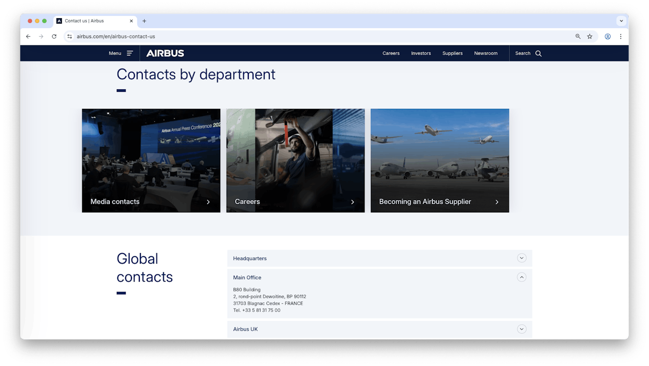
As a global corporate giant, Airbus operates across dozens of departments and regional offices, so helping users find the right contact quickly is the top priority on their contact page.
The page uses visual tiles for key areas like media, career, and supplier inquiries, allowing visitors to instantly navigate to the most relevant section. Scroll down, and there’s more: Contact information is organized by sub-department and region, making it easy to reach the right team without the guesswork.
There’s even a short FAQ section — if you’re interested in buying a plane or have an idea or invention, there’s even help there for you.
9. Booking.com
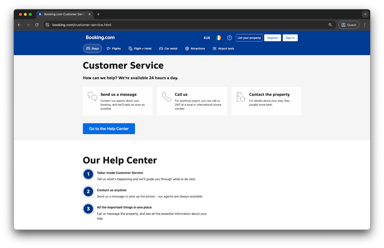
When it’s 11 p.m. and your hotel says you don’t have a reservation and they are fully booked, what you need is a clear contact page highlighting the 24-hour support line.
Booking.com’s customer service page delivers, focusing on giving guests clear and easy ways to reach out for immediate help, whether that’s messaging an agent, calling for urgent issues, or contacting the property directly.
While there’s still a prominent button to the help center for self-service, you’ll notice it’s underneath the contact information. This is the opposite of what we saw with Vivobarefoot above, and it highlights the importance of knowing your customers and your product or service.
Booking.com’s approach shows they’ve thoughtfully recognized that when their customers need help, it’s often urgent, and direct contact with a human is probably necessary.
10. Massimo Dutti
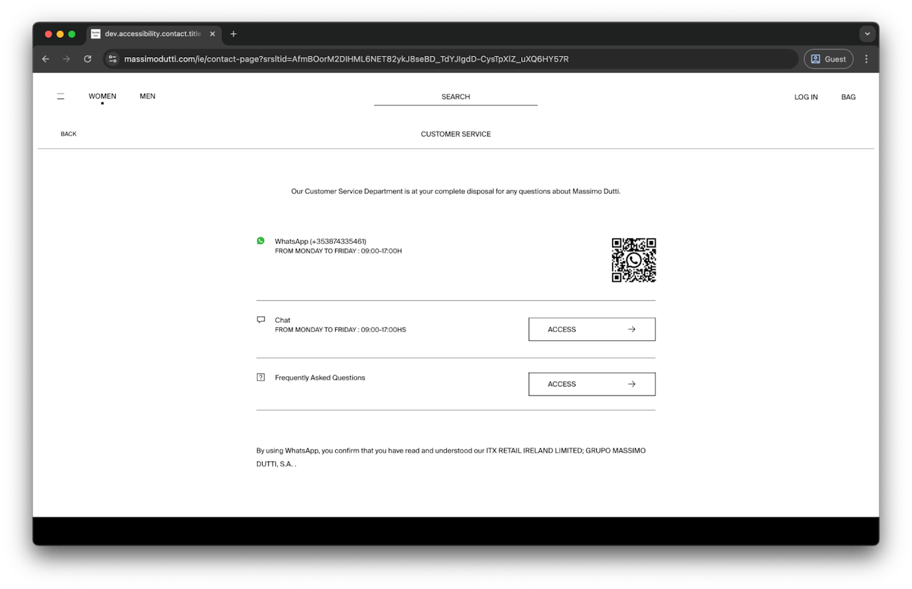
Massimo Dutti’s contact page follows the same minimalist and modern vibe the fashion brand is known for. Support is available via WhatsApp and live chat, all while clearly stating their business hours. They also add direct access to their help center, keeping things neat and actionable.
The layout is clean, functional, and mobile-friendly, with a scannable QR code for quick WhatsApp access.
11. Oura
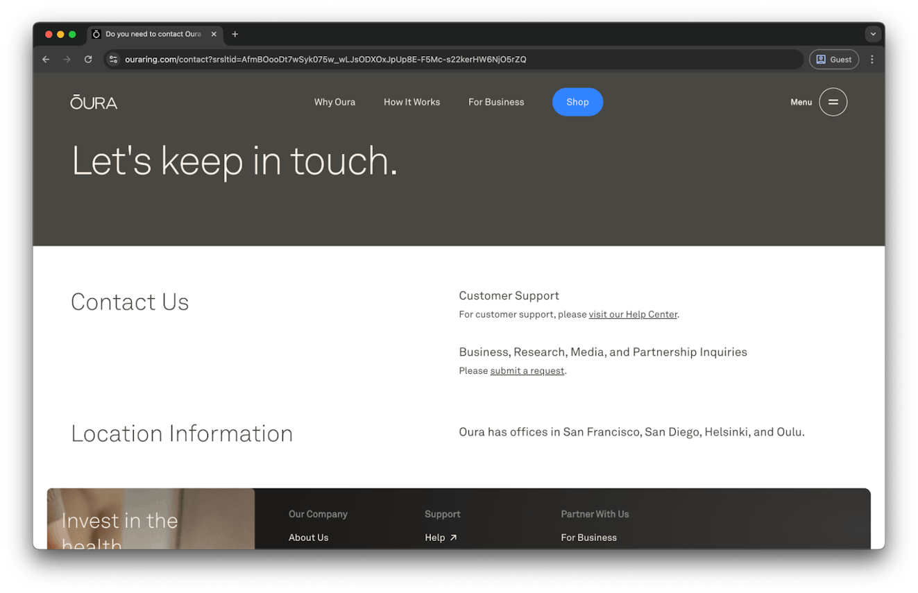
A simple way to segment inbound inquiries is to follow Oura’s example.
Needs are neatly split: Customers are guided to the help center for support, while business, research, media, and partnership inquiries have their own dedicated request form. Besides that, the page reflects the brand’s aesthetic with a clean and elegant design (and a tempting Shop button, just in case).
Oura also highlights their global presence with listed office locations, giving a subtle nod to their credibility and reach. It’s simple, structured, and easy to navigate.
12. The Guardian
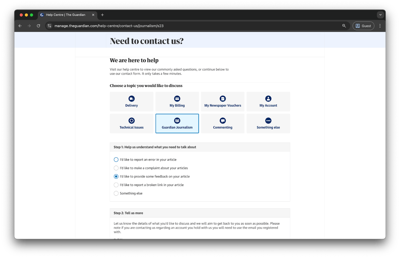
The Guardian’s contact page uses guided steps to make sure messages land with the right team. Users select a topic, answer a few quick questions, and are routed accordingly, helping them get the answers they need more quickly.
It’s a great example of how thoughtful form design can streamline support and routing. While many brands are using chatbots and AI to gather this information in a more conversational manner, this segmented form likely leaves even less room for error.
13. Boody

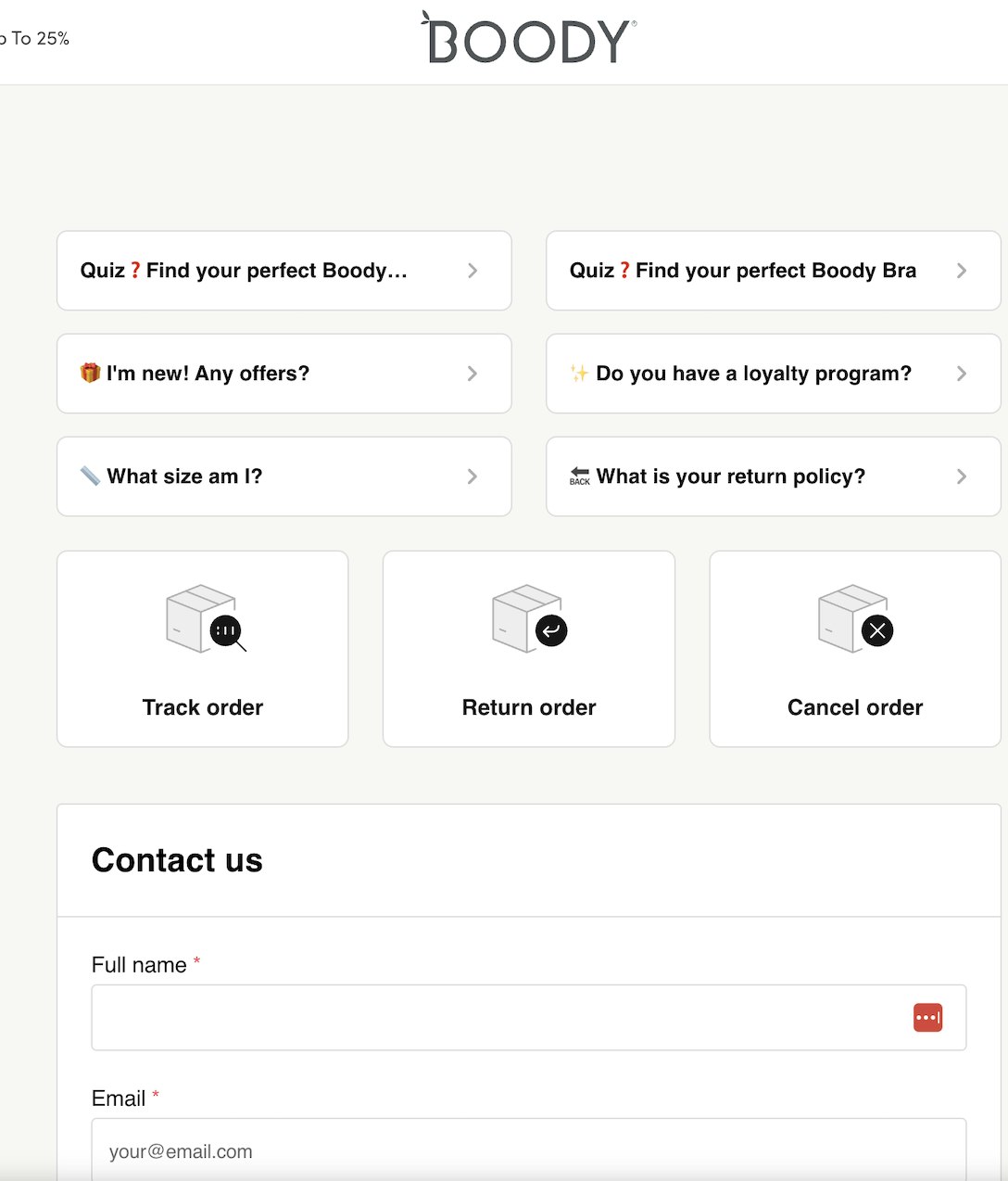
Sometimes, all you need is a trusty form. Boody keeps things simple and clean by letting users contact them through a form, which captures the essential information without overwhelming customers.
But the things that are really great about Boody’s contact page are the things that surround the form. At the top, there are quick access buttons for their most common requests and for engaging and educating customers.
At the bottom, there’s an opt-in for a 15% discount for new customers, incentivizing visitors to try Boody out.
It’s a great example of a contact page that does a lot more than offer contact information.
14. Ten Thousand
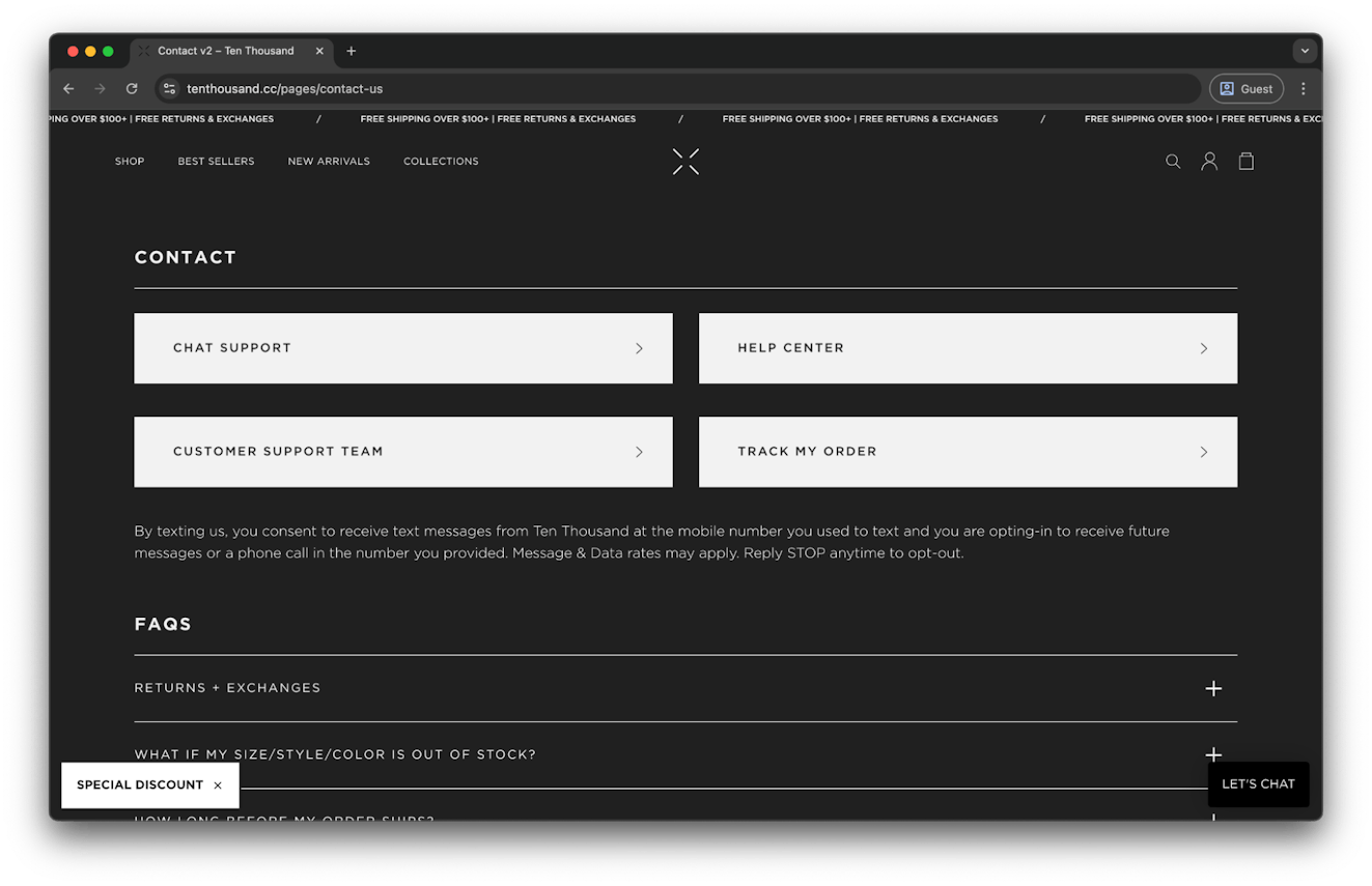
Four prominent buttons lead Ten Thousand’s users directly to chat support, the help center, order tracking, or the customer support team — no scrolling, no fluff, no confusion.
Paired with an expandable FAQ section that links out to resources like their help center, this layout makes it easy for customers to get what they need fast, whether they're browsing from their phone or their laptop.
15. IKEA
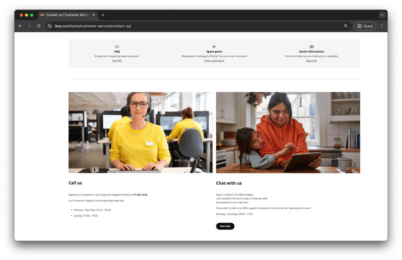
IKEA’s website is known for being human-friendly and easy to navigate, and their contact page follows the same philosophy. The page blends self-service and direct support effortlessly. FAQs and common topics are featured right at the top, helping users quickly find answers on their own.
For human help, two clear options are presented: call the support team (with business hours listed) or chat with a clearly-labeled chatbot (with the possibility to connect to a real person during working hours).
It’s approachable, informative, and designed to get users the help they need with the same ease as placing an online order.
16. Bugaboo
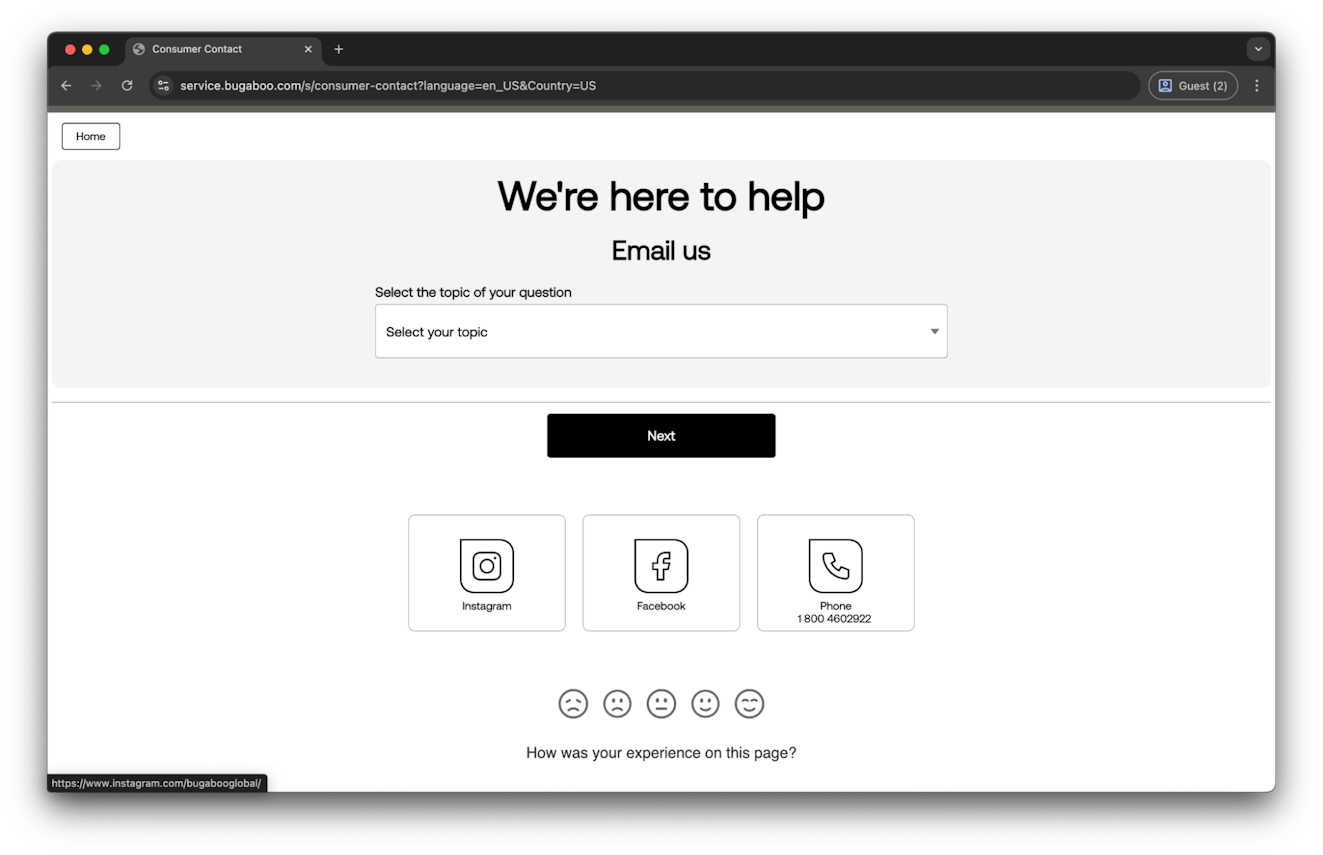
Two things are unique about Bugaboo’s contact page.
First, they give Instagram and Facebook a prominent place on the page. That’s not very common, but it’s a clear nod to where their audience is most active.
Second, Bugaboo embeds a quick feedback tool at the bottom of the page, signaling that they care about improving the support experience. That kind of direct ask for feedback is something we haven’t seen on many contact pages, and it’s a great idea for brands looking to improve feedback loops with customers.
17. 15Five
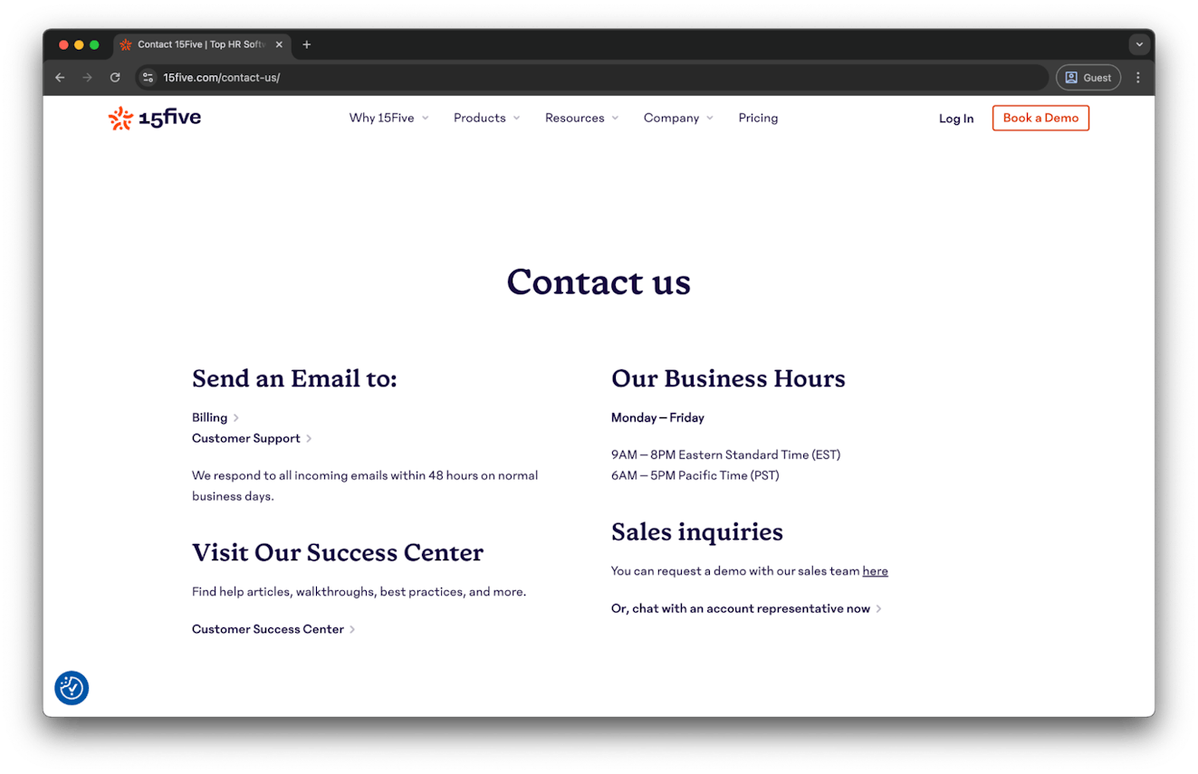
15Five’s contact page makes contacting the company easily accessible, regardless of what users need. Users can easily reach out to billing, support, or sales with clear links, business hours, and a stated 48-hour response window.
This page also directs users to their customer success center for self-service, highlighting the value by mentioning resources like a walkthrough, best practices, and more. It’s as simple as can be to navigate and find what you need, making for a great experience.
18. Patagonia
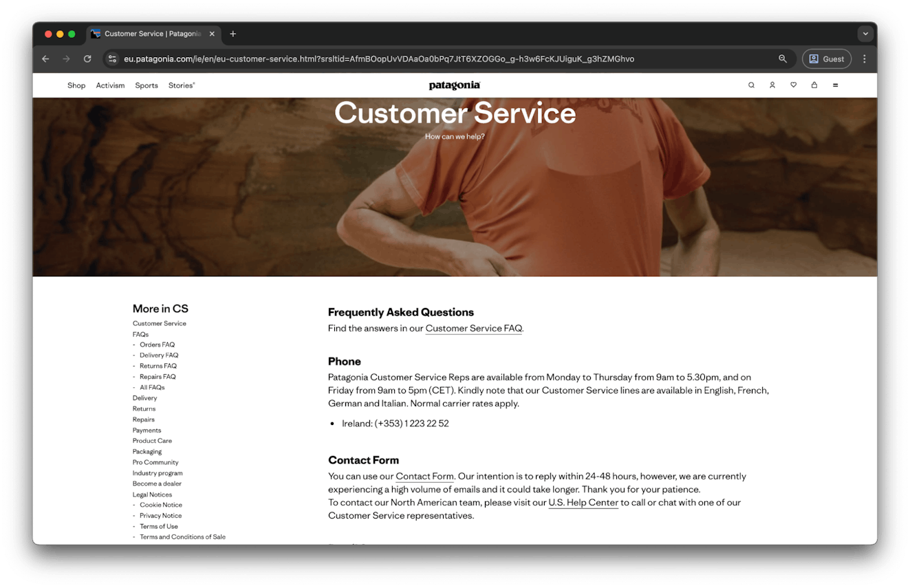
Patagonia’s European contact page is an incredible example of multilingual support.
It clearly lists out available languages customers can get help in and when live help is available. Even better, the listed phone number updates automatically based on a visitor’s country. Whether you’re in Ireland, Germany, or Italy, you’ll always see the right number to get the help you need. This thoughtful touch helps users feel comfortable and confident from the start, knowing exactly how they can communicate.
They also set expectations upfront by stating their typical response time to email inquiries (24-48 hours) and acknowledging potential delays — a small detail that goes a long way in building trust and transparency.
To top it off, Patagonia includes a sidebar for easy navigation and a well-organized FAQ section that adds value without overwhelming the page, making the overall experience both informative and user-friendly.
19. Atlassian
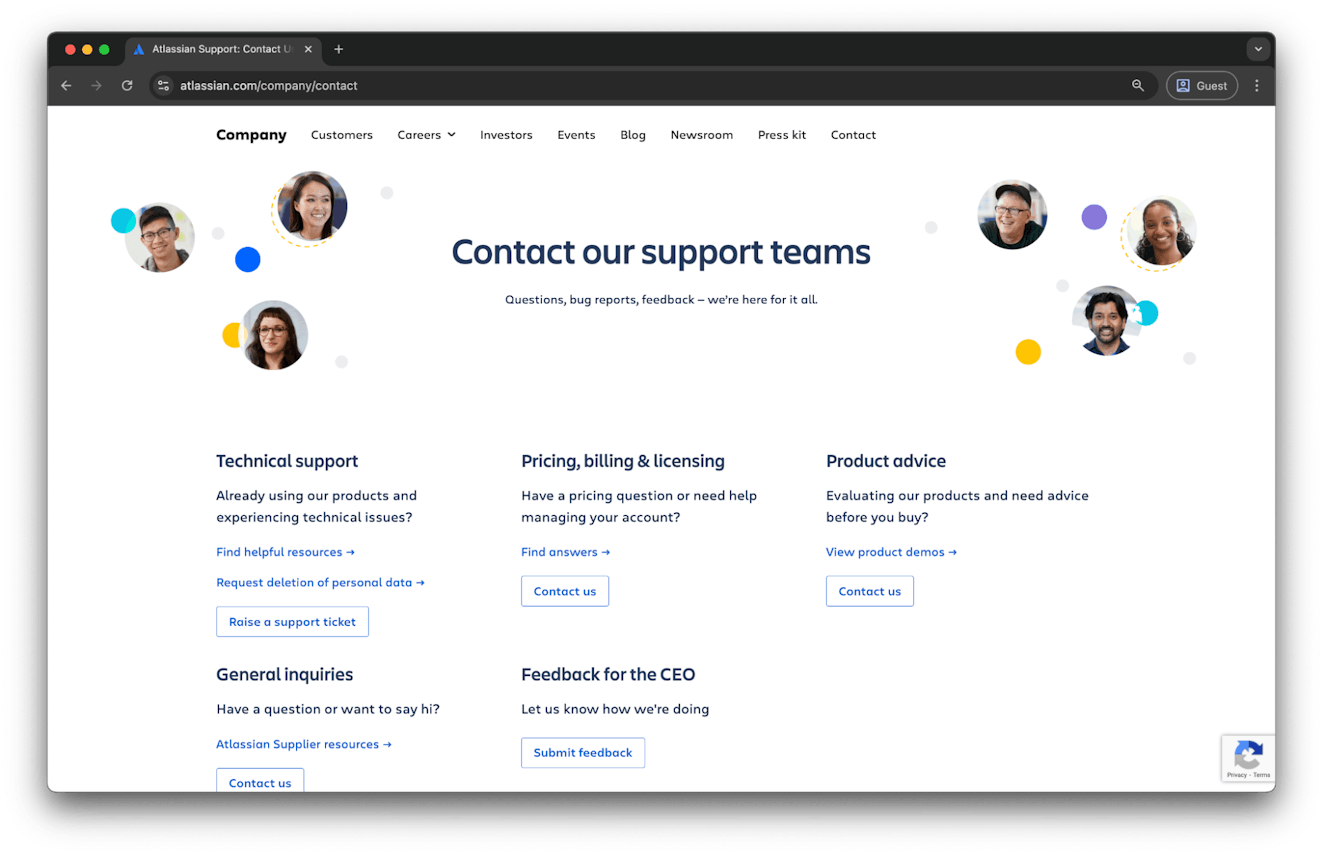
A contact page for a global company with over a dozen products isn’t an easy thing to build, but Atlassian pulls it off well. Rather than funneling every question into a single inbox, Atlassian gives users direct lines to the right teams from the start.
Need tech support? Billing help? Pre-sales advice? They’ve got dedicated sections for all of it, each with a clear description, handy links to relevant resources, and tailored contact options.
They’ve even included an option to send feedback to the CEO — a thoughtful option that stands out from the pack.
20. Target
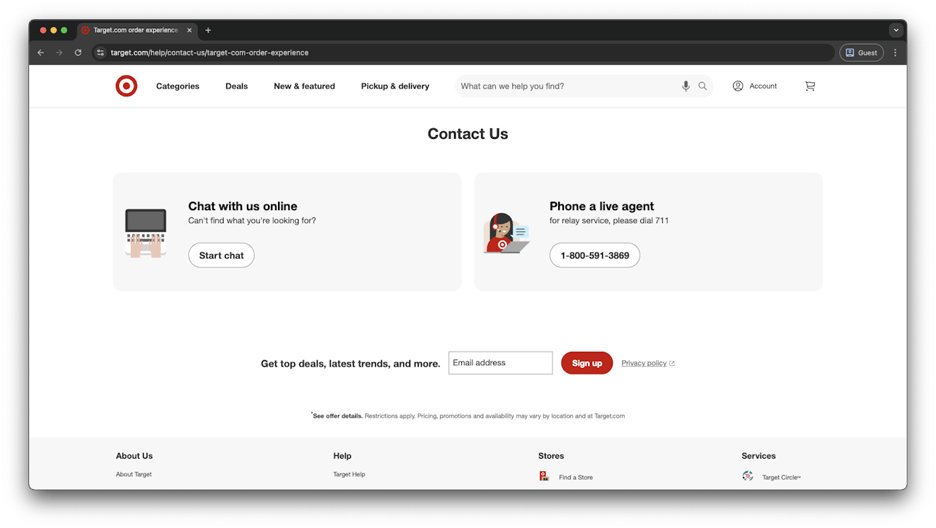
Target’s contact page starts by narrowing down customer issues with big, clear options. Depending on the option they select, they’re given content from their help center or two clear support paths: start a live chat or call a support agent directly.
This two-option layout keeps things simple and accessible. Friendly icons and straightforward language reinforce the brand’s approachable, customer-first feel.
Follow these best practices to create the perfect contact page
Based on the examples we’ve shared, here are some best practices you can follow to build a high-performing, user-friendly contact page — one that actually gets used and improves your customer experience.
Ensure all relevant contact info is included
Your contact page shouldn’t stop at a basic form. Use it to clearly list every way someone can reach you, whether that’s via phone, chat support, social media, or even at a physical store.
Giving people options lets them connect with you in the way that’s most comfortable for them.
Add links to your Help Center
Not everyone who lands on your contact page needs to speak to a human. Many are just looking for quick answers.
Linking to your help center or knowledge base gives users the chance to self-serve, which helps reduce the number of support tickets landing in your inbox.
Whether you should make your help center the focal point or a secondary option on your contact page depends on your customers and your product. For emergency situations (like Booking.com), lead with live support. For an ecommerce or B2B brand, leading with your help center probably makes more sense.
Send a confirmation email
There’s nothing more discouraging than sending a message and hearing…nothing.
When a user opts to reach out via your contact page, let them know you’ve heard them by automating a quick confirmation email (bonus points if you mention how long it usually takes to get back to them). It’s a small touch point that provides a big reassurance that their message was routed correctly, and it will reduce the likelihood they’ll follow up with duplicate messages.
Keep it on brand
Just because it’s functional, it doesn’t need to be boring.
Your contact page is still part of your brand experience, so be sure to treat it that way. Use consistent visuals, tone of voice, and messaging so your users know who you are, even when they’re just looking up your phone number.
Don’t overcomplicate the form
When someone needs help, sometimes less is more. It’s often best to take a minimum viable approach on your contact forms. Only ask for what you really need to help the customer, and make it easy to upload attachments or select relevant categories.
Route inquiries by topic
Use dropdowns, filters, or visual tiles to guide users to the right topics or team based on their needs (e.g., billing, technical support, or media inquiries). This makes it easier to route requests to the right team, which means you’ll be able to provide faster responses to your customers.
Your contact page is one of the most important pages on your site, because it’s where your customers go when they need help. Don’t let it feel like an afterthought. Spend some time on it and be thoughtful when building it out, and your customers will thank you (possibly even with fewer support tickets).
Larry Barker
Larry has been working in and leading customer experience teams for over a decade. He currently leads CX & Operations for Teamshares, in addition to running Supported Content, a niche content marketing company that creates expert CX content.